
Small things can make a big difference. Website navigation is something like that for your website. You may have an awesome website but if your navigation is not user-friendly. Then the brilliant effort is going to be wasted.
How much traffic you are going to have depended on the ease and engaging power of your website navigation. In research, it is found that 50% of the customer visit your internal page through the navigation. That means this has a heavy role to play.
It is a bit difficult to do than said. But it really worth your time. Why not invest some time which can uplift your website tremendously and help you to get more traffic.
Here you are going to find effective ways of website navigation which will work like magic to increase conversion in your website.
Make it Customer-oriented
when you are planning for navigation for your site, often you fall in a trap of explaining your business. Which takes away your time, while returning you a zero result. Which is frustrating and results in a higher bounce rate. Whereas, focusing on customers’ origin can give you a better result.
Let us see an example :
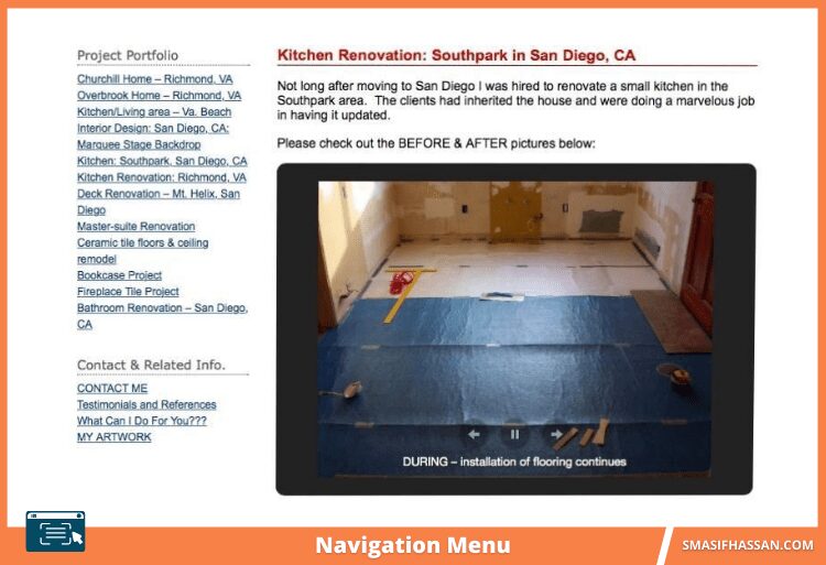
Have a look at this home renovation company. Their main focus should be on their work photos because it can attract the customer’s interest. But look at their navigation on the left side. They added 13 links of their previous work.
These mere links will create difficulty to find the company’s information.
In spite of stuffing links they could have linked each category they renovate i.e., living room, kitchen, bedroom etc. As potential customers would have got a clear idea about their services, so these can help them with better user experience.
If they include a single link and built sub-navigation, the customer will find the contact page, pricing information etc. easily.
Research on keyword and choose relevant items
Many think that keywords research is required only for blogs or contents. Do some keywords research to optimize your website navigation too. Choose some relevant and popular keyword related to your menu items. The pages you link in your navigation are basically important so, try to optimize the pages on a popularity basis.
Suppose you own a business of event management. And you believe that pages about your blog, menu, request a quote form is important for the business. But what your customers are looking for can be different. To find out what a customer might be looking to take the help of Google’s Keyword Planner.
You may find something you never thought of.
Such as:
- Corporate Events
- Exhibitions
- Wedding planners
- Online fundraising events, etc.
If you are not providing these services at least you can think of starting these as people are searching for these.
Utilize the search autocomplete
Whenever we search anything on google it autocompletes with popular search query related to your search. This helps people not to write the whole thing, and they feel google understands their need, which keeps them motivated to stick with google searches.
You can also use those tactics for your website navigation. Customers will find the suggested and recommended related products on your website. This will give them a greater customer experience. They will not only get a good idea about your popular product or service but also might get hooked with your company.
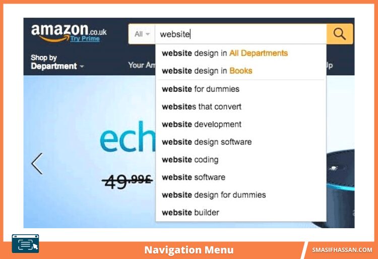
Amazon is a great example of using this feature.
Instead of searching among all various kind of products, users simply search for the product, they want. And it gives popular choice recommendations. It is convenient to use. And user-friendly. It also has the ability to keep customers longer on your website. And you never know your autocomplete options may remind them to buy things they forgot to buy. Moreover, they get a precise idea about your related products, and services they are searching for.
Proper Internal links increase traffic!
After you have managed to craft a great menu system, that provides great user experience. Do not forget about the interlinks. Keep the customer on-site as long as possible. Interlinks are also a good choice for website navigation. Create links of the relevant product within your contents.
Suppose you are selling living room furniture. In a page of the wooden sofa, you can link the cushions. Anyone buying a sofa might be interested in buying cushions too.
Why not help them to buy from you. This also provides a remarkable experience for your customers. It’s kind of spreading link net throughout your website.
But remember do not link any irrelevant product or service. This will lead to distrust and your conversion will be badly affected.
Watch Your Navigation words
You may have a brilliant menu, great products, attractive offers, but still, your sales are low. Isn’t it frustrating? Yes, it happens. Because of miscommunication. What you tried to show or say your customers might not understand. It is because of your visitors do not understand your navigation words.
Be very careful about choosing navigation words. Because if they are ambiguous. Visitors will feel uncomfortable and will move to other options without even seeing the products.
An online ticket company SubHub fall into this problem. They had named a button, “See details” to navigate the customers to their ordering page. But the visitors didn’t understand this. Then they change the name to “Go.” This simple change increased their conversion rate by 2.6%.
So choose words wisely. It is not necessary that what you know is also something the customers would catch.
Built Mobile-responsive Website
Nowadays mobile searches for websites is no less than desktops. So having a mobile version of your website is kind of obligatory. Visitors expect the navigation experience of your site in mobile as smooth as the desktop version. You will see a positive impact on your conversion rate after making a mobile version. It is very natural but sometimes ignored because mobiles are handier.
Frank body a cosmetics brand is a great example, for it. They designed awesome Mobile-friendly web design. At the top, they have their sticky main navigation bar. Scrolling down a user will also find a separate sticky menu of product category on the bottom of the screen.
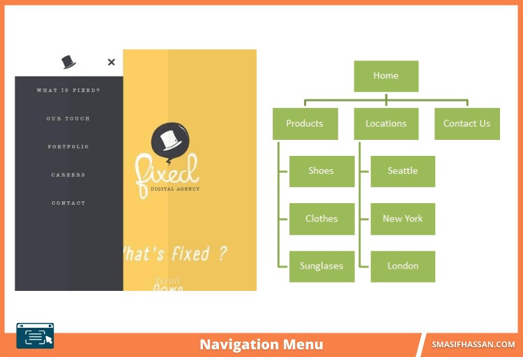
Choose Your Menu Style
You can find a lot of options for navigating style. Some of them are text links, drop-down menus breadcrumbs, fly out, and recent popular one is hamburger styled menu.
Not every type of menu bar will work for you.
Although it is tough to say which one will be better for your website. You have to test a variety of menu bars. But obviously there are some recommendations.
Let’s see some samples :
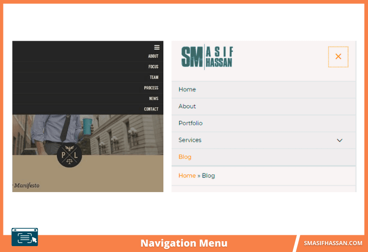
1) It is mostly accepted navigation menu. Generally used by promotional brands, professional brands and different type of generous works.
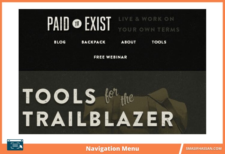
2) A simple navigation menu with a dark background. The beautiful calligraphic fonts added extra elegance to it. It presents a general overview of the website precisely.
3) First comes the logo icon. Right below that icon user will find the navigation menu. After selecting any particular field it gets highlighted which is a great addition. As the user gets to know where are they now.
Fat footers
Normally this position is stored for secrecy and lawful links. However it has also become quite easy to show email sign up options, address etc. in details and also social links. Many people want to know if having a full sitemap on display in the footer is a better idea or not. If the user has to scan by using the footer links to find out what they’re looking for then maybe the AI is not working the way that it needs to.
That’s why it is being said that the footer is typically the last option of call for many searchers. Many of the websites still use this process & in my opinion, it needs to be used for sites that hold heavy content or retail sites where showing the security icons and way of payment is quite authentic.
Large footer not only serve up helpful links for those who like to navigate at the end but it can also work as a design tool to form your layout. Butterfly has sketched a few sites that take advantage of large footers, and this way of progressing was good mainly because of the huge number of content and also the big footer appreciates design arrangement.
Conclusion:
Menu Navigation is an important part of web designing. Based on your customers’ needs you have to frame your navigation menu. It should be clear and easy to use. Visitors should find what they are looking for in the most straightforward way possible. The internal link structure, menu, search function all should work together.
Key Take away for you are:
- Be customer-oriented
- Do some keyword research
- Interlinks can play a great role
- Choose words wisely
- Find out your navigation bar style
- And Fat footers are also something visitors look for
The tips you just read will help you to optimize your navigation and hopefully will take you to your goal — conversions.
Enjoy the SEO journey!